Today is the birthday of James McNeill Whistler (1834-1903). In celebration, today we offer up this excerpt from an article about Whistler’s Green and Violet: The Evening Walk, a painting in Crystal Bridges’ permanent collection. The full article, written by Daniel E. Sutherland, Distinguished Professor History at the University of Arkansas, appears in the latest issue of C magazine, Crystal Bridges’ membership publication. –LD 
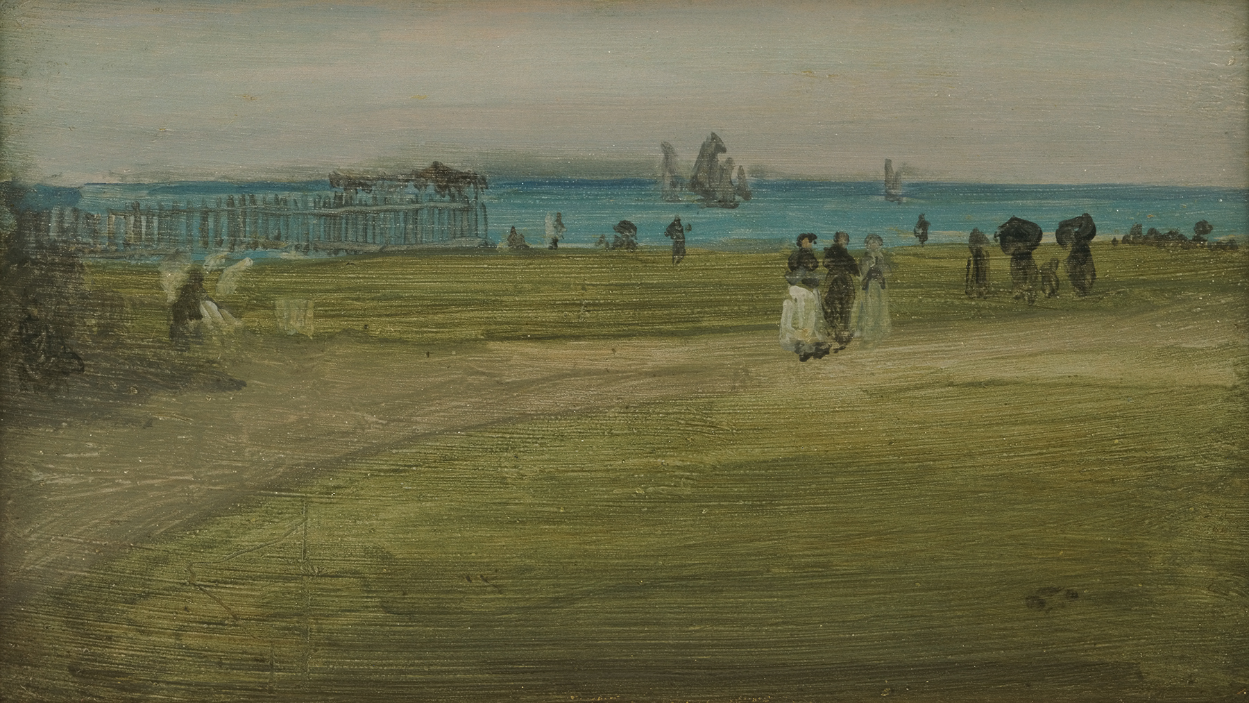
Green and Violet: The Evening Walk is a complex and energetic little picture that shows several sailboats in the distance and groups of people strolling on the beach. Whistler enhanced this sense of motion by placing the boats, set against a high horizon, on nearly the same level as the people, and constricting the space where the people promenade. A pier, jutting into the water, confines the beach and limits our view of the narrow strip of water beyond, which, in turn, further concentrates attention on the movement ashore. Whistler relied primarily on just three colors, and spread his paints thinly and fluidly—in long, ribbon-like strokes for the sky, water, and beach—with people, boats, and pier inserted by heavier vertical strokes.
He would have used a quite different technique earlier in his career. In those days, emulating Gustave Courbet, the French Realist, Whistler preferred a thick, impasto look. However, his painting took several dramatic turns in the mid-1860s. He rejected Courbet’s dependence on color to fix the eye and hold a composition together. Courbet’s influence had been “odious!” he complained to his closest artist friend at that time, Henri Fantin-Latour. “The regret I feel and the rage, hate even, I feel for all that now,” Whistler insisted, “would astonish you.” Thereafter, he limited his palette to a few “opposing colors” and strove for a balance of generally muted tones. The thinner, more fluid application of his paint he learned not from the French, but from the English—historically from Thomas Gainsborough, more personally from his friend Albert Moore, the Neo-Classicist. Although the effect is less striking on wooden panels than on canvas, Whistler compared it to “breath on the surface of a pane of glass.”
Finally, there is the title of Green and Violet. Early in his career, by at least 1863, Whistler rejected the long-accepted notion that a painting should tell a story. Instead, he championed the new but growing philosophy of “art for art’s sake,” which insisted that the most important requirement for any work of art was that it be beautiful. To emphasize this point, he used either musical terms, such as symphony, nocturne, or harmony, as titles for his paintings, or emphasized their dominant colors.
So here, in one small painting, easily overlooked in a gallery of much larger pictures, Crystal Bridges has a miniature masterpiece that demonstrates several of the most important innovations of the nation’s finest artist.